


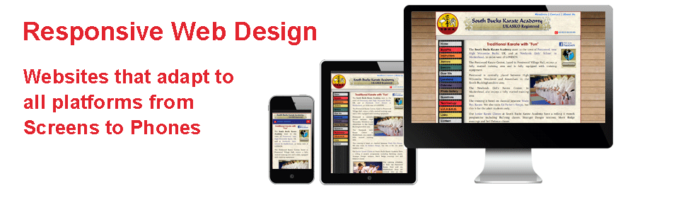

Responsive Website Design

Over 50% Website usage in on phones. We build websites that are responsive to all platforms, Screens, Tablets and Phones.
From mid 2015 Google have changed the rules as it is now a Google requirement that all websites wanting to be found in mobile search results are "mobile friendly". If they are not, their search ranking will be reduced.
This means your website should display differently on a mobile device to how it does on a desk top computer. Text, images, buttons etc should all be shown bigger on a phone making it easier for visitors to browse and navigate their way around your website when viewing on a small screen.
At Chilternweb we build all websites to be responsive / mobile friendly that 100% pass the Google test.
Try these tests:
- How easy is it to read your website on a mobile phone screen?
- Do you find it easier to view your site on a large PC screen?
- Are the menu buttons too small to operate?
- Can the text be read without the need to open out the screen.
- Can the images be seen properly without zooming in?
- Is there too much displayed on the tiny screen?
OVER 50% OF WEBSITE VIEWS ARE ON A MOBILE
You do not want visitors to give up on your website as they need to zoom in to find what they want